This infographic animation, which I created for Janssen, a pharmaceutical company within Johnson & Johnson, for their “You Touch” health awareness campaign in Türkiye, combines two different layers of content within a single narrative: the campaign's health messages and the campaign's own performance data.
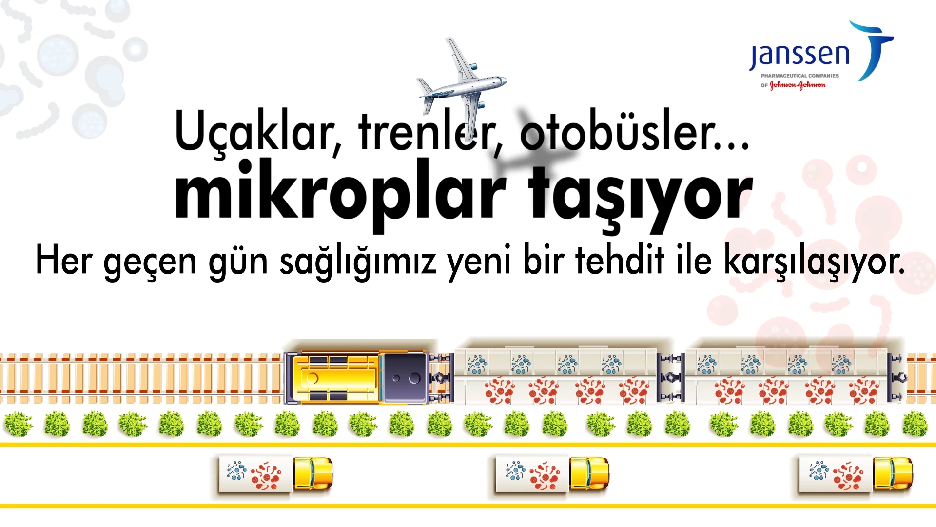
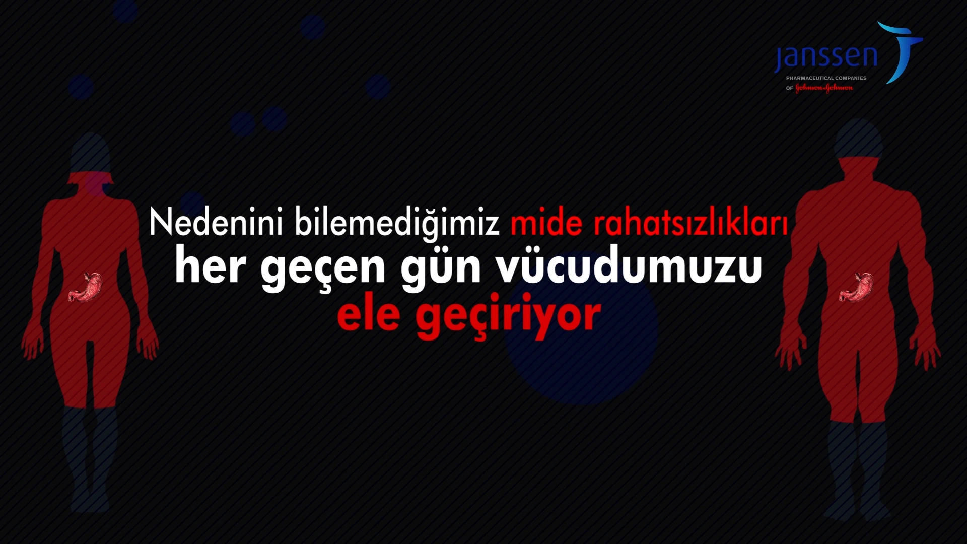
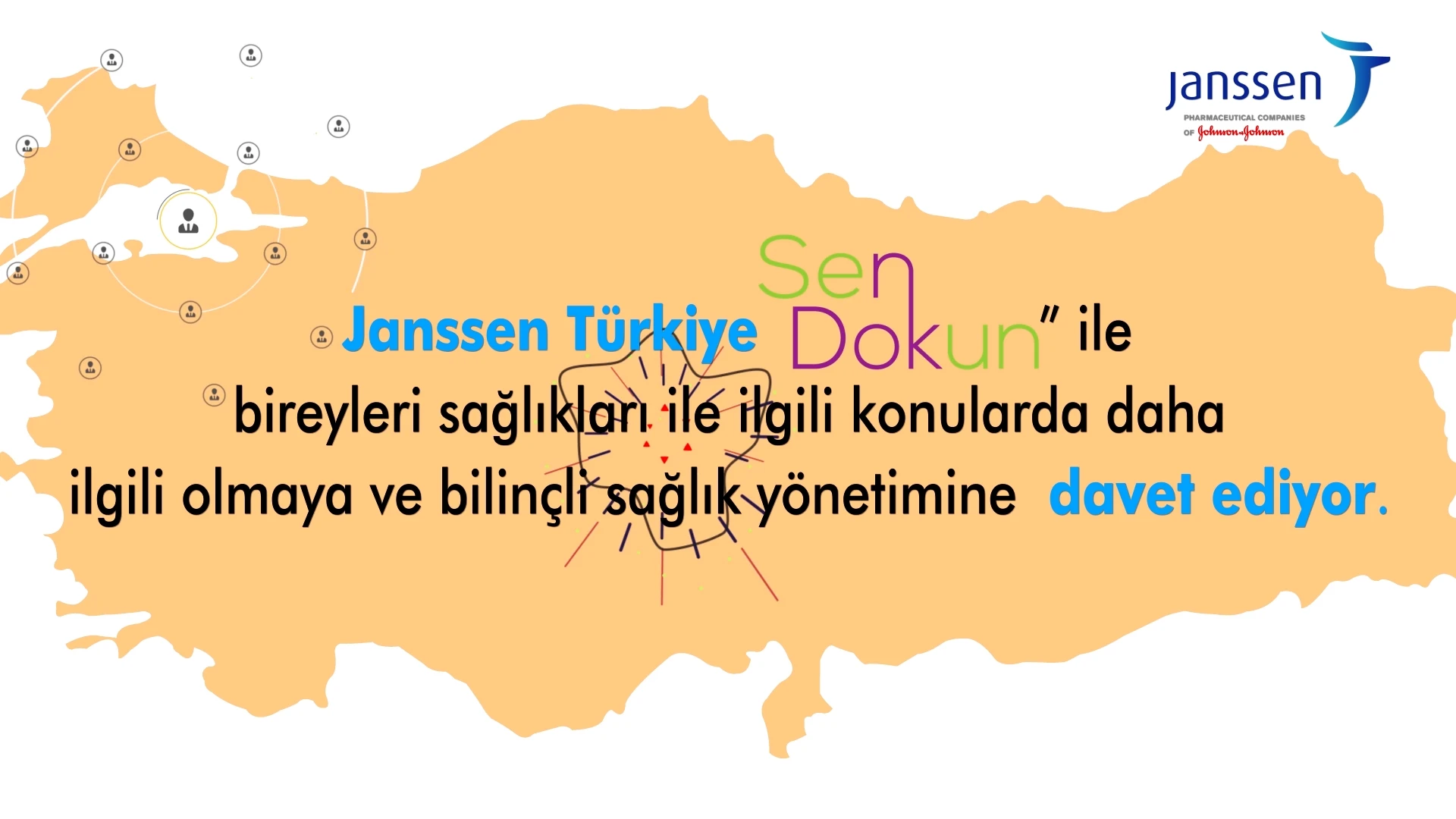
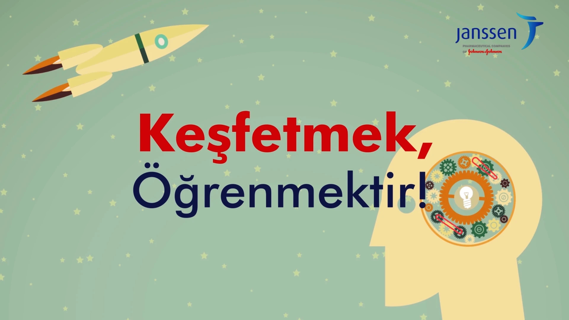
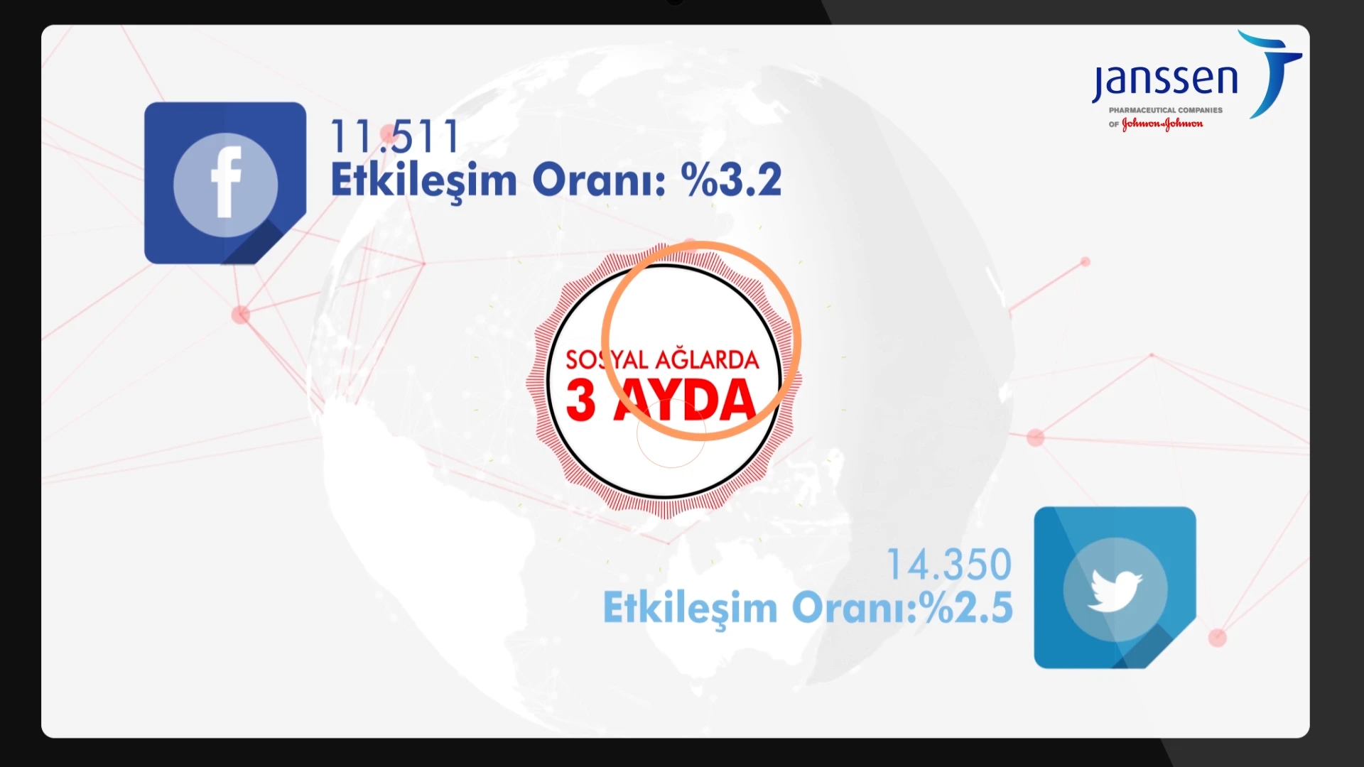
The first part of the narrative conveys awareness messages — the prevalence of stomach ailments, how microbes circulate through transportation networks, and the importance of informed health management. Each message finds its own visual interpretation: organs highlighted within silhouettes, a train with carriages full of microbes, and a mind operating with gears. The second part visualizes the campaign's reach — participants scattered across a map of Turkey, three-month engagement figures and rates on social networks, and a globe surrounded by network connections.
The design language was established to carry the different tones required by these two layers. Flat vector illustration and kinetic typography are the main tools; color is the primary variable conveying the emotion of the narrative. Dark backgrounds and red accents establish a warning tone in the awareness sections, while the campaign sections proceed on a light background with the organization's own palette — purple, green, blue.
The real challenge of this type of work is the narrow creative space: in the pharmaceutical industry, corporate identity guidelines are strict, messages are approved, and the designer cannot go beyond this framework. This is where the job of information design begins — transforming dense information into a followable rhythm within a limited visual system. In this project, typography was not a decorative element, but the animation itself.